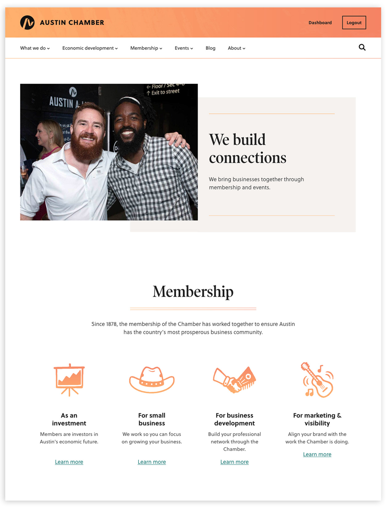
 www.austinchamber.com
A key player in the development of Austin’s economy, the Austin Chamber of Commerce has helped businesses expand and create 424,800 jobs since 2004. We came aboard to assist with strategy, brand design, and the build-out of a design system that will help meet their site needs for years to come.
While the initial ask was for Paravel to provide style guidance along with a handful of page templates, it quickly became clear that the Austin Chamber would benefit from having a way to design, build, and update many pages at scale. They needed a design system.
This decision shaped the process, allowing for a tight iteration loop with equal TLC given to all pages.
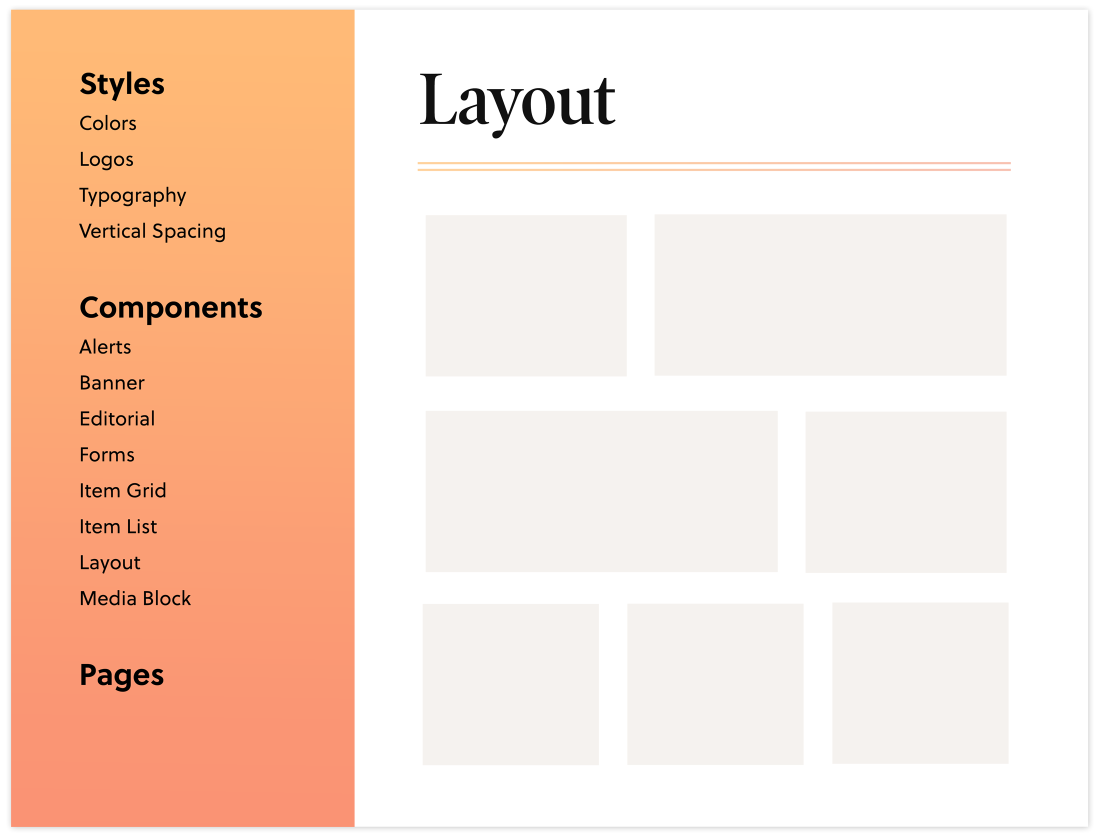
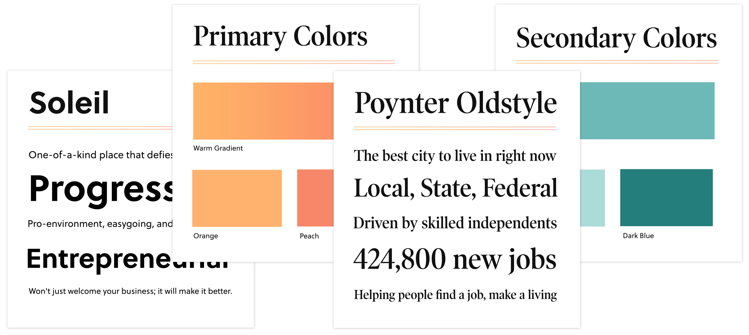
Mood boards were quickly translated into a web-based style guide. We opted to bring some energy to the masthead with a warm gradient, and a relaxing teal to balance out the rest of the site.
Typography-wise, we fell in love with Poynter Oldstyle Display by Tobias Frere-Jones for headings, and turned to Soleil by Wolfgang Homola for a charming, yet hard-working sans.
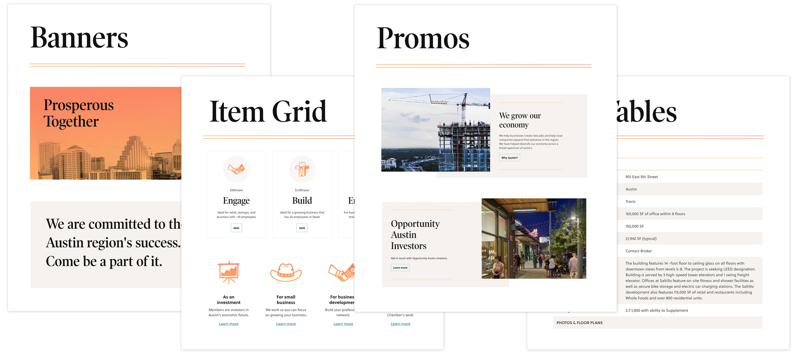
Next, we extended our styles to a robust set of components. With a clear understanding of the content needs of the site, we consolidated one-off elements into “multitasker” components, continually testing and refining during the implementation process.
To further expand our Austin-centric vibe, we collaborated with our friend and local illustrator, Bryan Butler, to create a fun and unique icon suite.
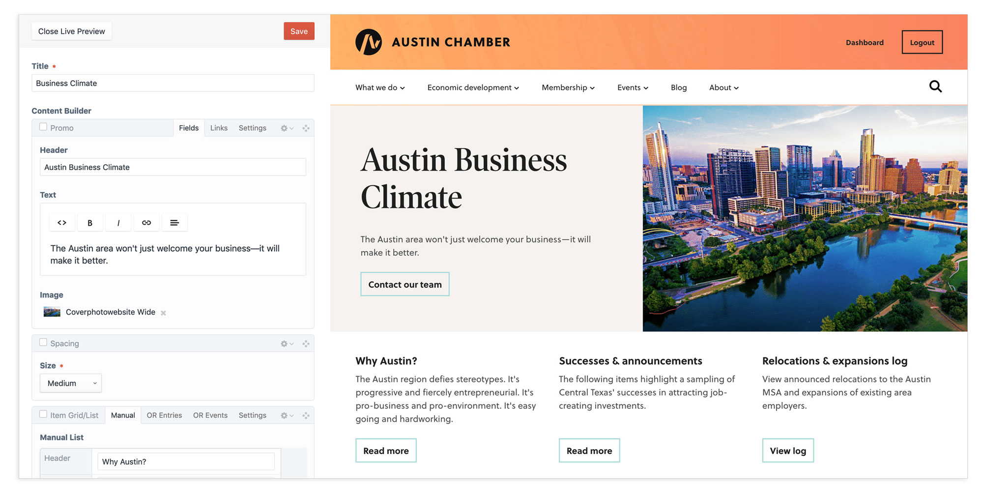
We worked with Flipbox Digital on the Craft CMS implementation. The design system we created helped ensure a quality and speedy development process for the live site. Flipbox is a talented bunch, and were a pleasure to work with.
Hats off to Jonathan Packer, Brian Ecklund, Amanda Gutman, and the entire team at the Austin Chamber of Commerce. We enjoyed getting to know them, and we’re incredibly thankful for their trust and camaraderie.
