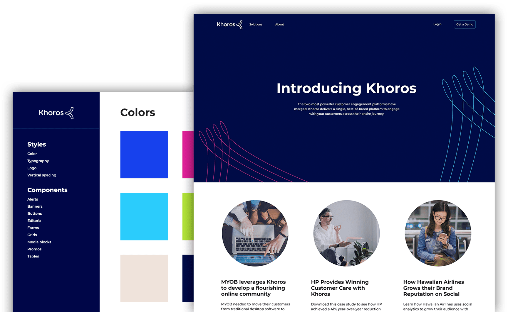
In collaboration with a team of in-house designers and managers we had six months to build a debut website announcing the Lithium and Spredfast merger.
All we had to begin with was a deadline and two separate websites that needed to be unified, so we used a design system and our prototype-centric process to build while the new company name and identity were being determined.

Solid foundation
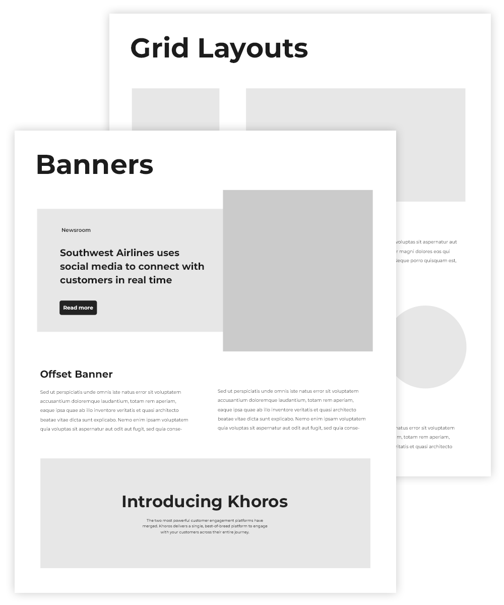
Where do you start when handed a tight timeline but no visuals or design aesthetic to work with? A prototype! Knowing that if we waited for a design direction, we’d not be ready with a website when the merger was announced, we immediately began prototyping components.
Show your work
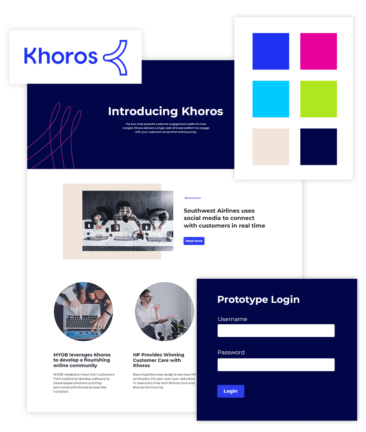
The prototype lived online in a password-protected project hub so that we could collaborate with the design team as well as leadership real-time.
Rather than expending heaps of effort into planning and documentation, we were able to fill in blanks and develop the site as new bits of direction and content materialized. We love this approach because 100% of the team’s effort goes into deliverables that the users see (web pages).


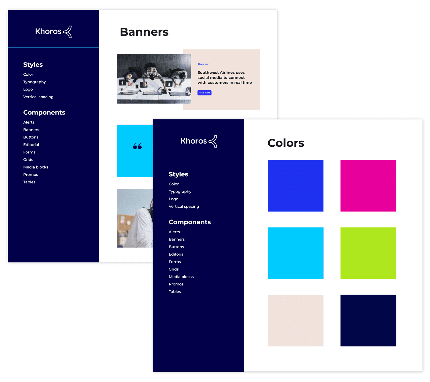
As the brand was defined, we added colors, fonts, etc. to the prototype, establishing the beginnings of a design system. This environment proved to be indispensable when it came time to transfer components into page prototypes.
