 www.typofonderie.com
Founded by Jean François Porchez in 1994, Typofonderie is an independent French type foundry that approached us to overhaul their web presence in 2011. Already big fans of their typefaces, we jumped at the opportunity to build them a new responsive site.
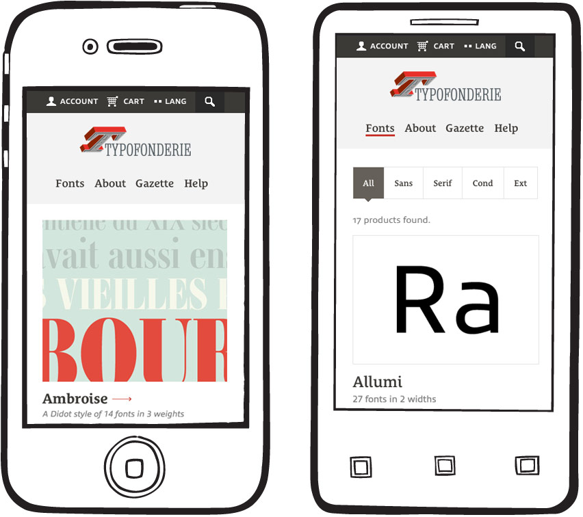
At the time, we had yet to build a responsive eCommerce site, and were eager to tackle things like search filters, checkout flows, and type testers in a fluid-width setting. To ensure a consistent experience across all devices, it was essential for us to make certain that no content or functionality was unnecessarily pared down.
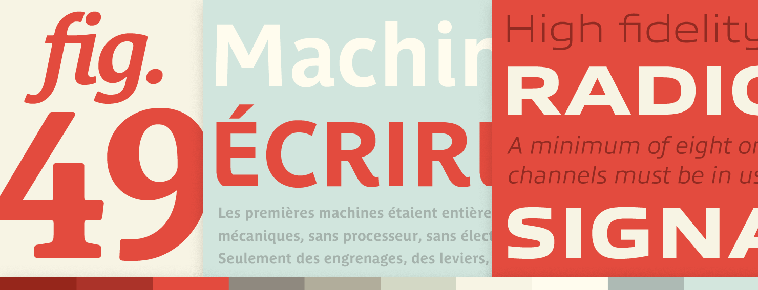
To kick off the planning phase, we got to know the fonts. We began by building specimens and basic color palettes to showcase the extensive amount of styles, weights, and open type features in their collection.
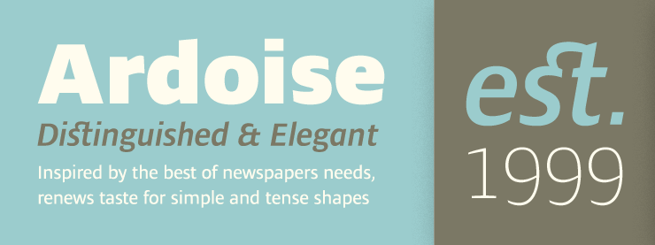
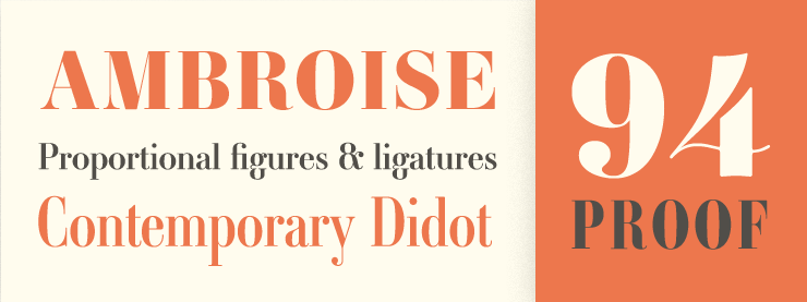
As we continued with the type specimens, we added colors and options to create a style guide that would accommodate Typofonderie’s ever-increasing font offerings.
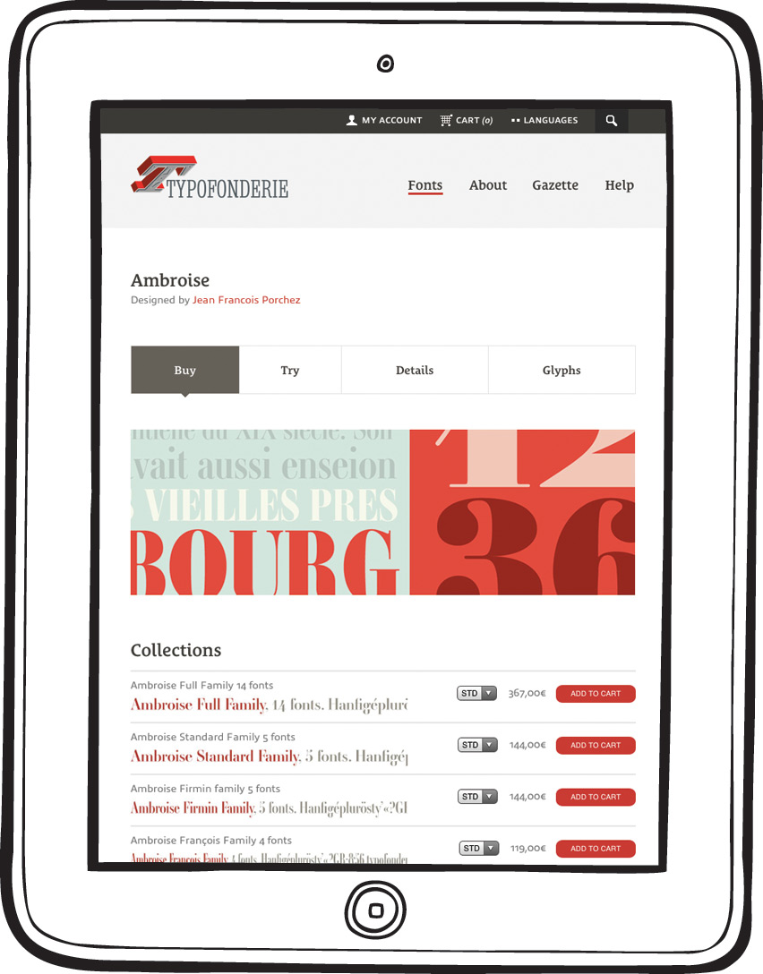
To help explore the numerous details associated with each typeface, we made it possible to browse & test any weight or style, read about the fonts history & creation, and view full glyphs & PDF specimens.
The further we explored, the more we realized how much work goes into expanding a font to provide multiple language support, open type features, and proper rendering.

Adam McCombs & Robert Banh from Taecho Group came on board to help us build out the French payment gateway and multilingual front-end offerings. It was a perfect collaboration.

We like to consider the Typofonderie site itself a type specimen. Thanks to the team at Typekit, the site is set in Typofonderie’s own Le Monde Courrier STD and Allumi STD.
