 www.papajohns.com
Early to online ordering and responsive web design, Papa John’s enlisted Paravel to build a design system that would aid redesign efforts and streamline their prototyping and testing process.
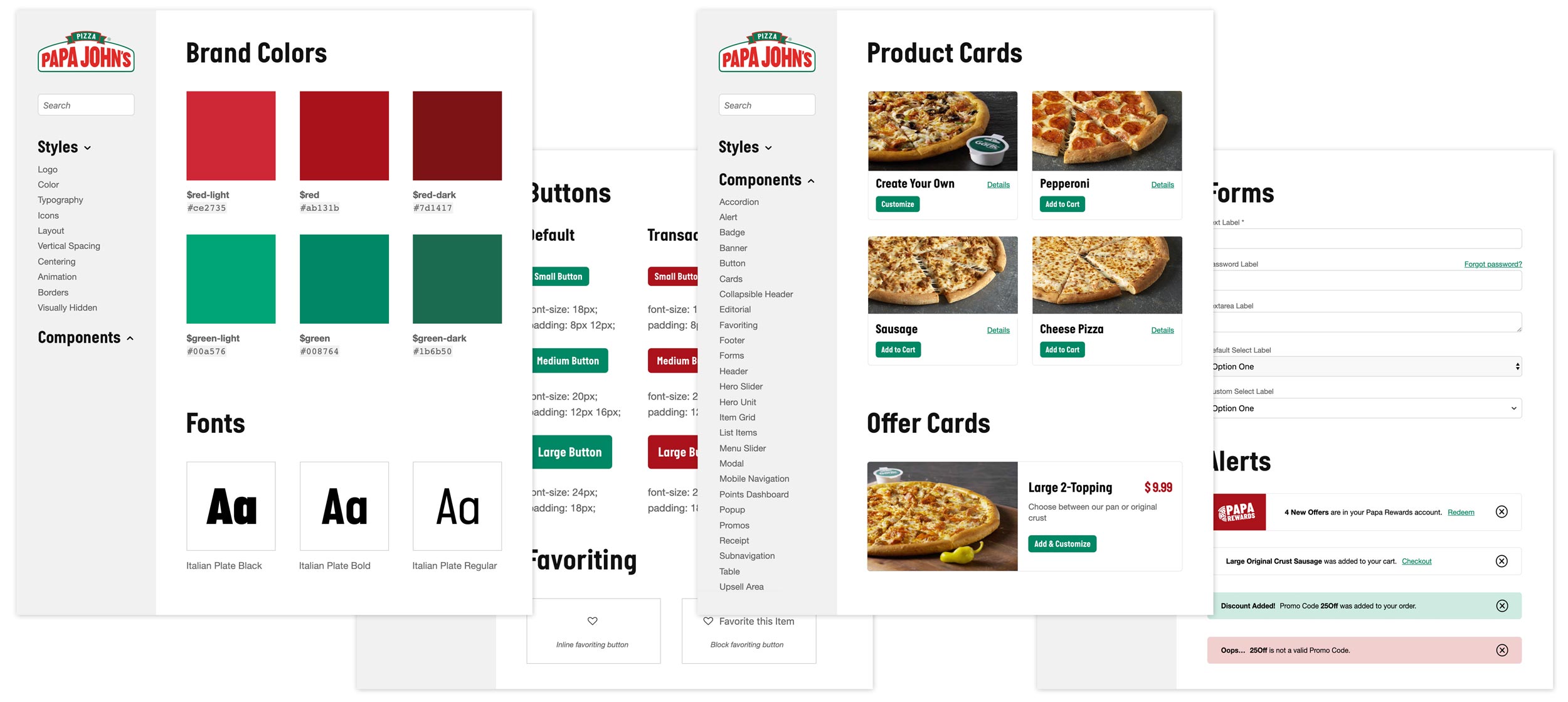
The pattern library evolved into a design system & process hub that has expanded to include page prototypes, performance metrics, accessibility guides, etc.
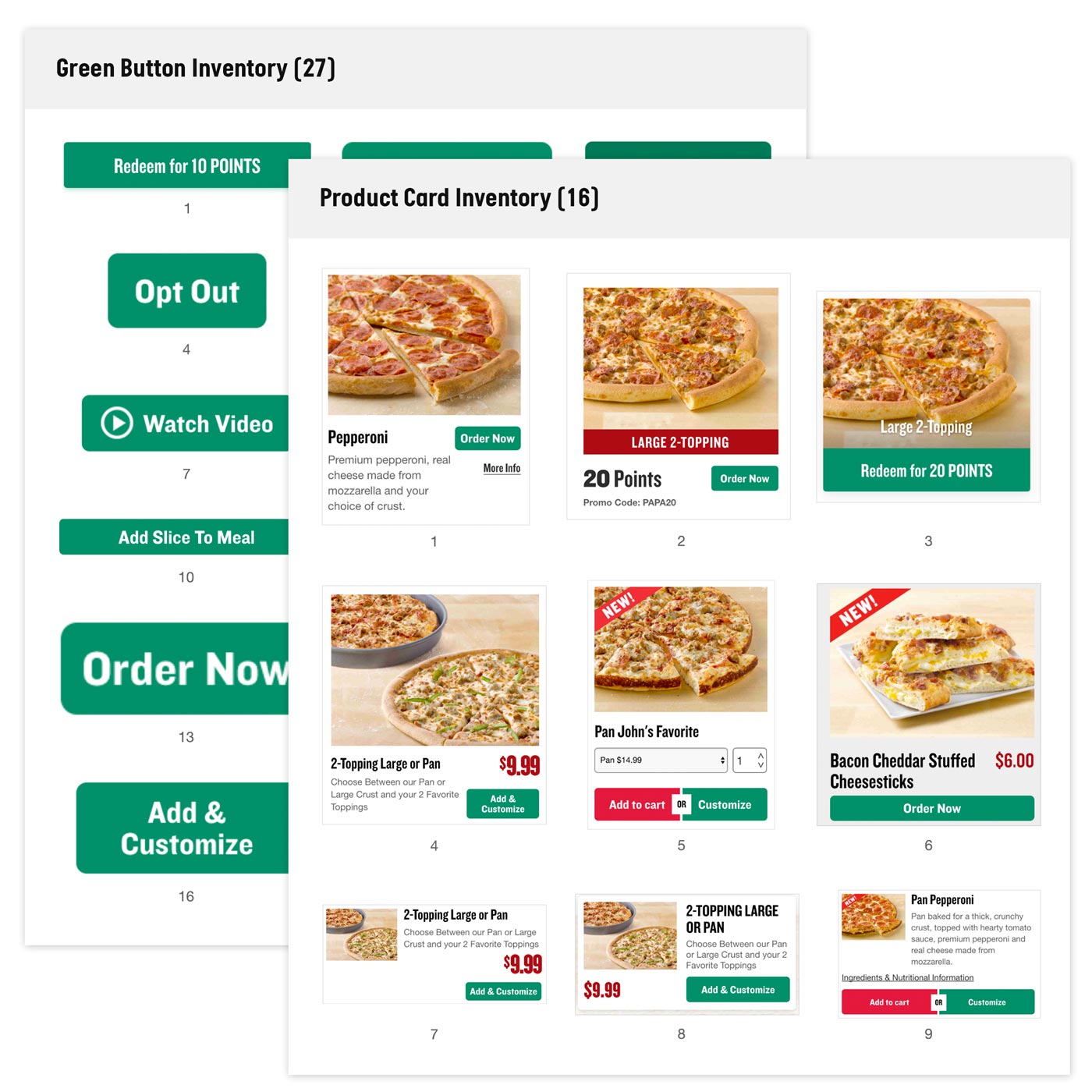
The hasty adoption of new techniques and features understandably yielded redundant code and one-off UI elements.
We conducted a component inventory and code audit that highlighted items that could be combined or even removed, resulting in an easily manageable design library and codebase.
-
CSS
-
Javascript
-
Page weight
We were able to recreate the entire Papa John’s website with ~25 components, which allowed us to make design upgrades and analyze kilobyte savings along the way. CSS was reduced by ~900kb and JS by 1.1mb, leaving the page weight 22% of its original size.
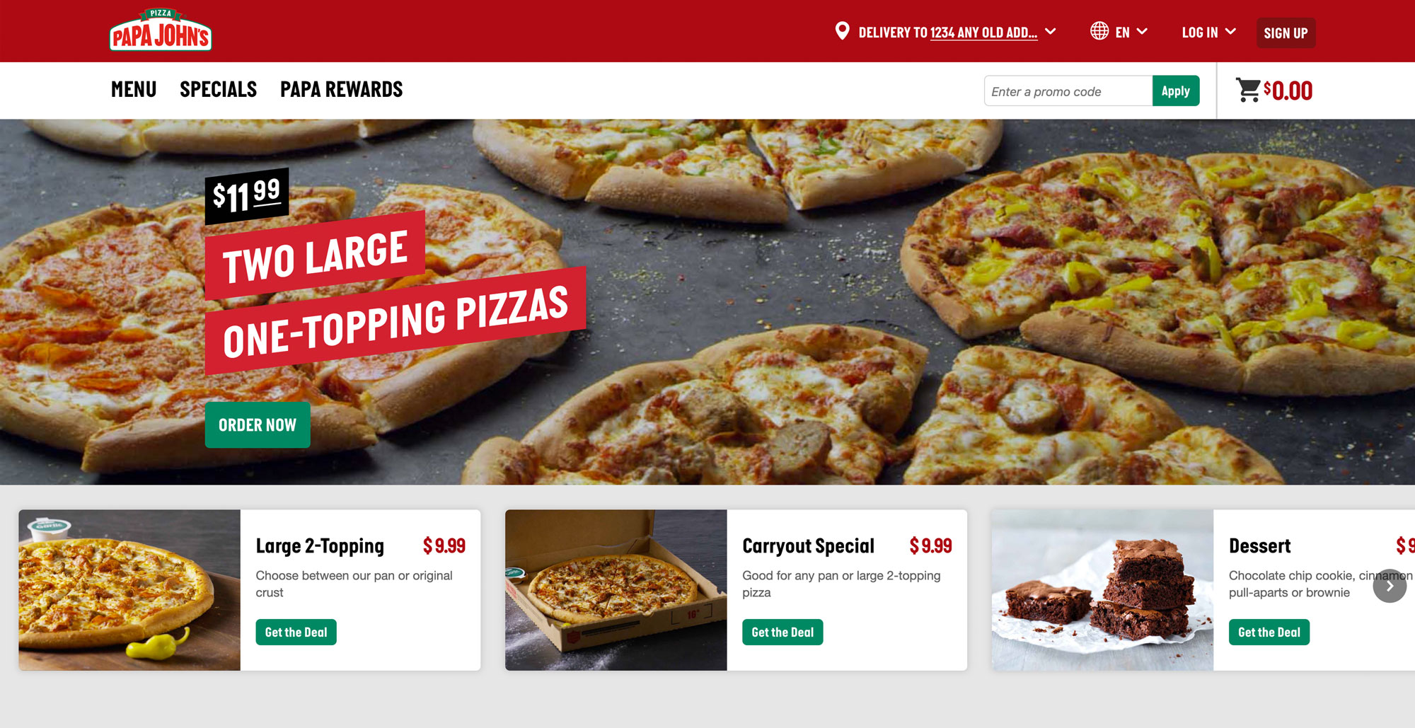
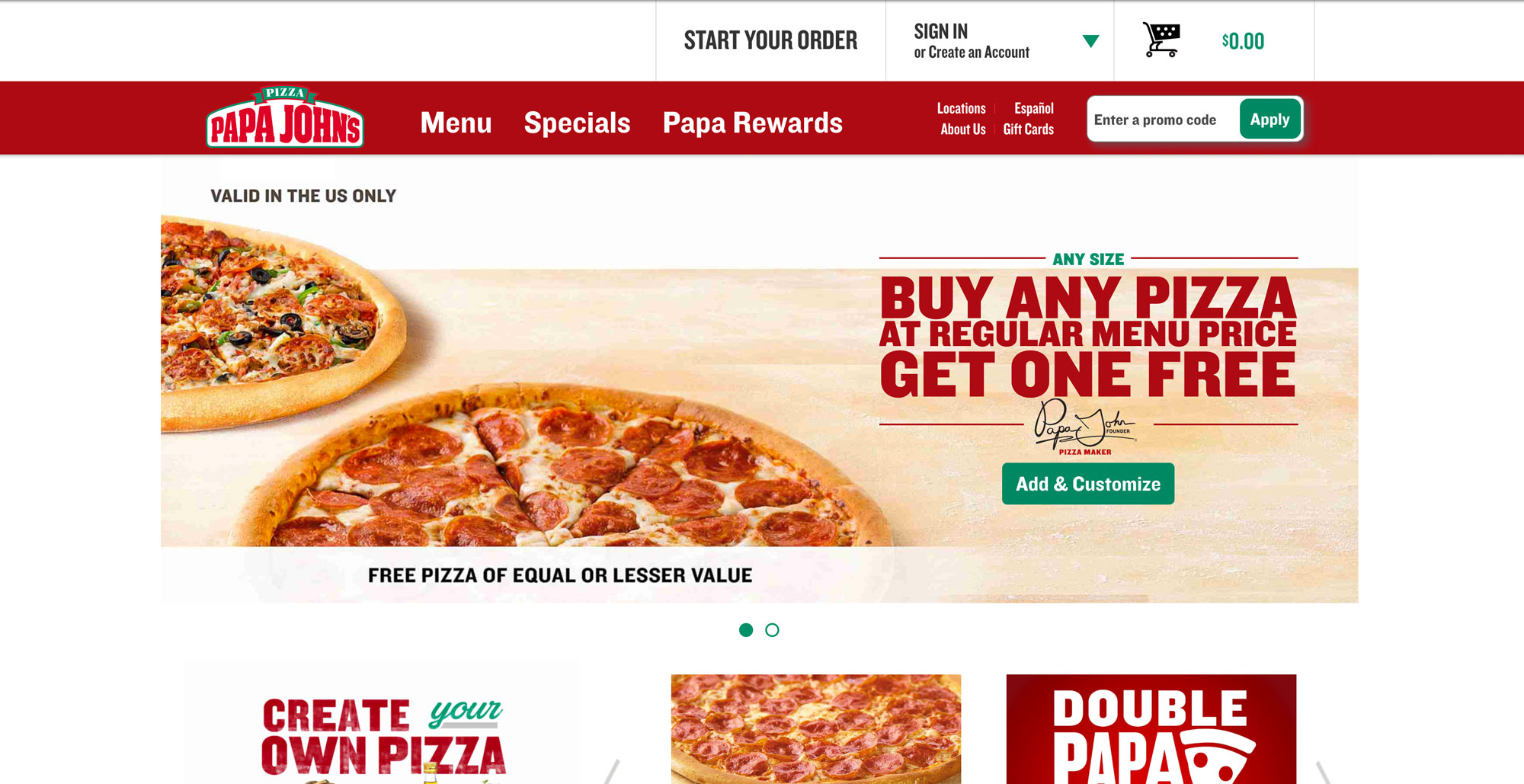
The design system allowed the team to reinvision the site in conjunction with new brand assets, product offerings, and content needs.
Informed by user and A/B testing, we were able to prototype quickly and deploy new features.
Experimentation helped yield increases in conversions and sales across the 5,000+ Papa John’s stores.

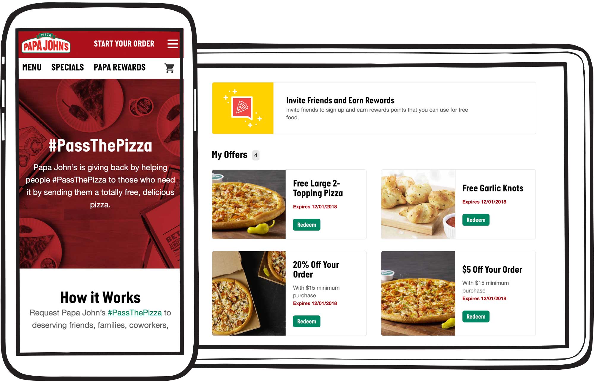
The Pattern Library allowed the team to quickly release marketing and social media efforts, like one-off promotions and a new customer loyalty program (which has been one of the highest-priority initiatives at Papa Johns over the past few years).
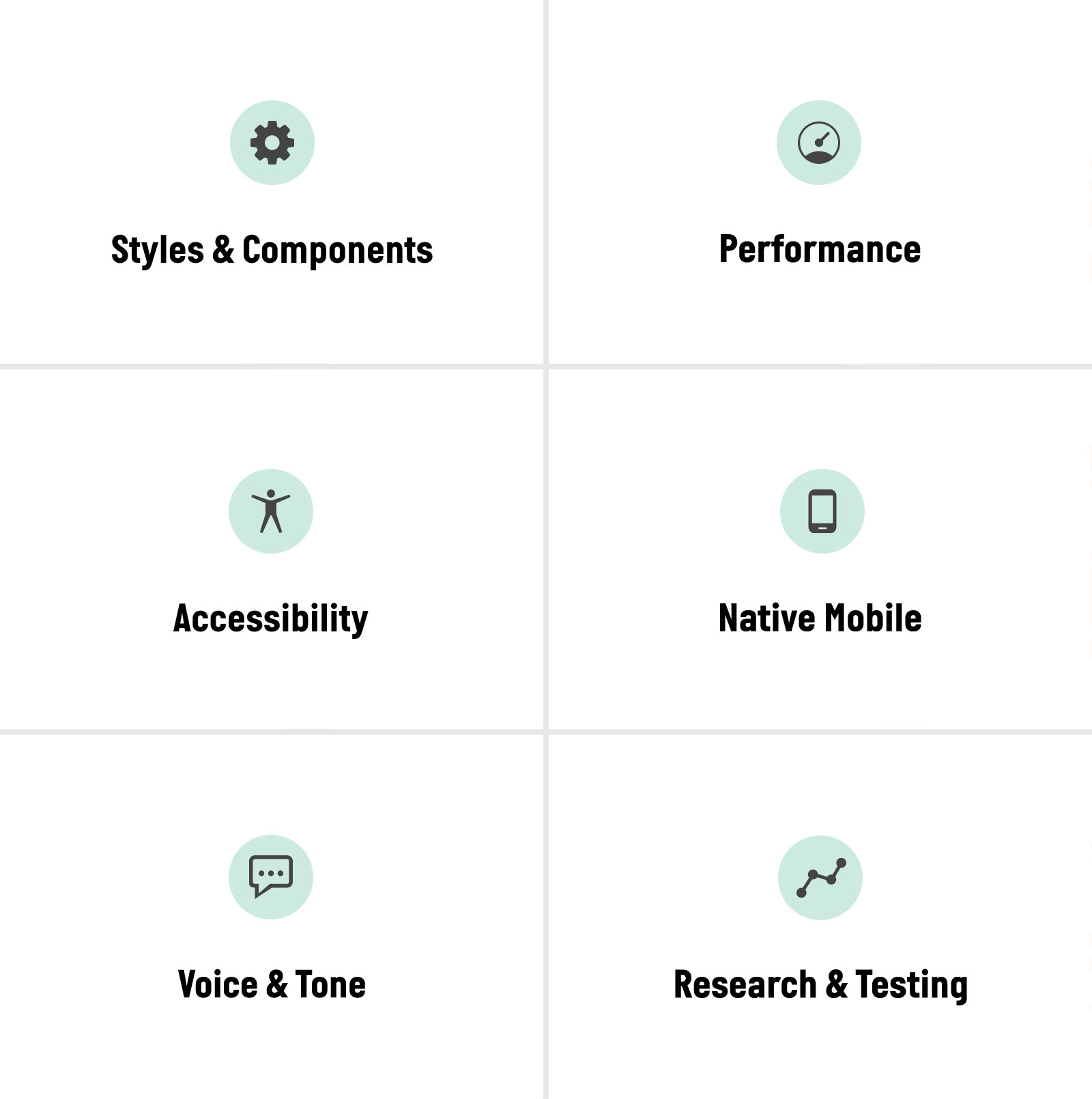
Paravel has also been able to assist with UX research, user testing, accessibility improvements, and (by enlisting some specialized cohorts) helped manage A/B testing and content strategy.
