
 www.microsoft.com
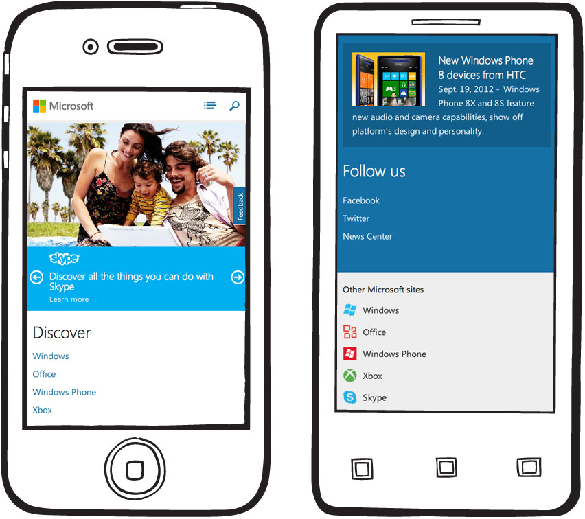
We teamed up with Microsoft to redesign one of the most visited sites on the web. The homepage got a complete design overhaul and a fully-responsive layout.
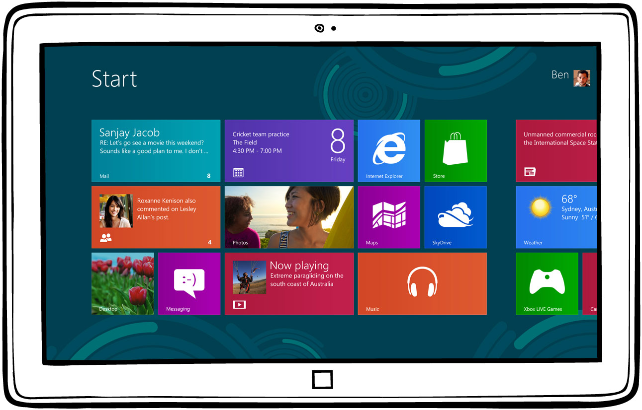
Microsoft had been making some bold moves in 2012 that centered around the launch of Windows 8. Their new design language (known formerly as Metro) coupled with exciting new product launches put them in a perfect position to extend these changes to their web presence.
We partnered with Microsoft’s immensely talented homepage team to design and prototype how grids, rotators, video, and navigation work best in a responsive setting. This is the 17th version of their homepage, so we had an abundance of user stats and business goals to consider as each decision was made.

“Microsoft’s Site Redesign Will Introduce Mainstream Business To The Responsive Web”


Our favorite part of the project was Microsoft’s willingness to redefine itself, and it was just the beginning. We built responsive components that were integrated into the rest of their vast network. It’s been exciting to see how each property has evolved.
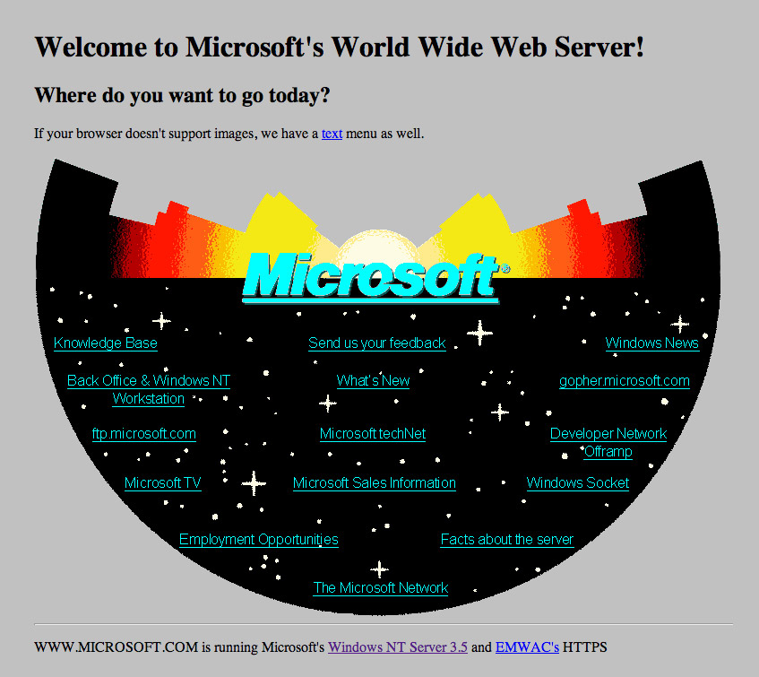

Two years after building version 17 of the Microsoft homepage Paravel was asked to look back twenty years and recreate the first version, originally launched in 1994. You can read more about the process at Dave’s Blog and on Microsoft’s post.
For the backstory on how this project came to be, check out Nishant Kothary's article. Other Microsoft projects: Lost World’s Fairs, Build