 www.marksimonson.com
Some of the first (and best) webfonts we ever worked with came from Mark Simonson. He’s been a graphic designer since 1976, and opened his own lettering and typography studio in 2000. Mark came to us for a site redesign with the goal of showcasing his typefaces.

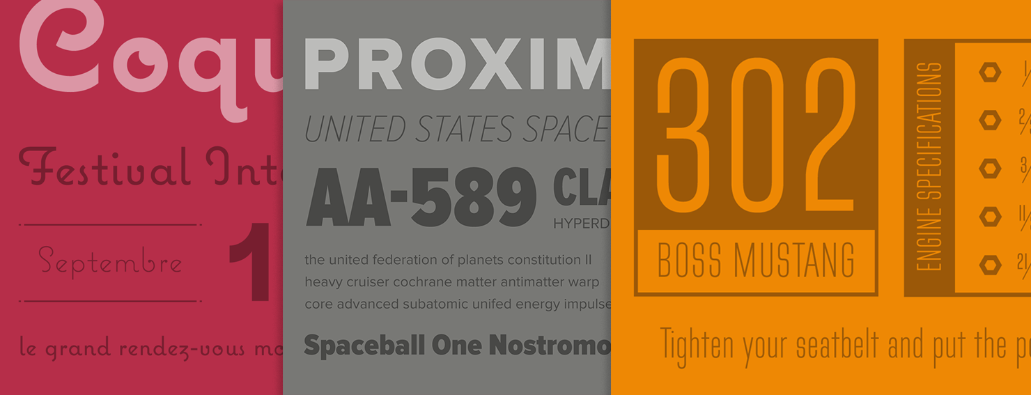
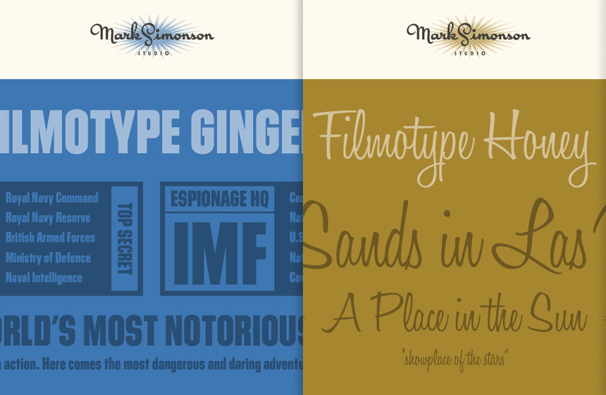
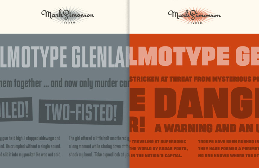
Unable to hide our giddy enthusiasm, we started by exploring Mark’s type catalog and making specimens. From there, we experimented with how the specimens might work in a responsive setting. To learn more about this part of the process, check out Reagan's post.


Each font page has a unique color treatment, large-format specimens, and resources for customers to explore. Mark is a designer himself so the simple structure of the page will allow him to design unique elements and expand new pages in the future.
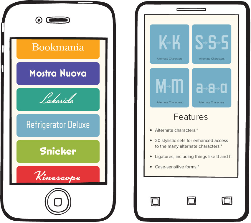
The site’s layout was planned from scratch to be fully-flexible and responsive. Users can easily browse Mark’s typefaces and read his articles from any modern device. We’re particularly fond of how the fonts page turned out.


We brought in Vector Media Group to help with the ExpressionEngine implementation. We’ve worked with Matt before on Jason Santa Maria’s redesign of The Morning News, and we couldn’t have been more eager to partner up again.

We’ve been serving Mark’s fonts via Typekit since Lost World’s Fairs, and this time was no exception. All of the text is set in Proxima Nova. Fortunately for us, that’s not the only webfont Mark offers. Be sure to check out all his fonts on Typekit.
